12 LinkedIn Photo Backgrounds That Make Recruiters Stop Scrolling
Gray studio, soft office blur, or outdoor? See 12 LinkedIn photo backgrounds ranked by recruiter appeal, with examples that survive LinkedIn's circle crop.
LC
LensCherry Team
AI Photo Experts • Updated March 2026
Quick answer: These 12 LinkedIn photo background ideas actually work in 2026 because they survive LinkedIn's tiny circular crop, keep the focus on your face, and still look credible in search, comments, and connection requests. The strongest options are light or medium gray, soft blue-gray, clean white, and lightly blurred office settings. Busy outdoor scenes and detailed lifestyle backgrounds usually lose because the background ends up louder than the person.
This page is built to help you choose faster. We will walk through 12 background ideas, rank the safest background families, show when each one works, and point out where people overestimate "personality" and accidentally make the photo look less professional. If your current headshot is the real problem, not just the backdrop, start with AI Photos for LinkedIn or compare profile-ready looks on LinkedIn Headshot.
Safest default: light or medium gray
Best corporate option: blue-gray or navy gradient
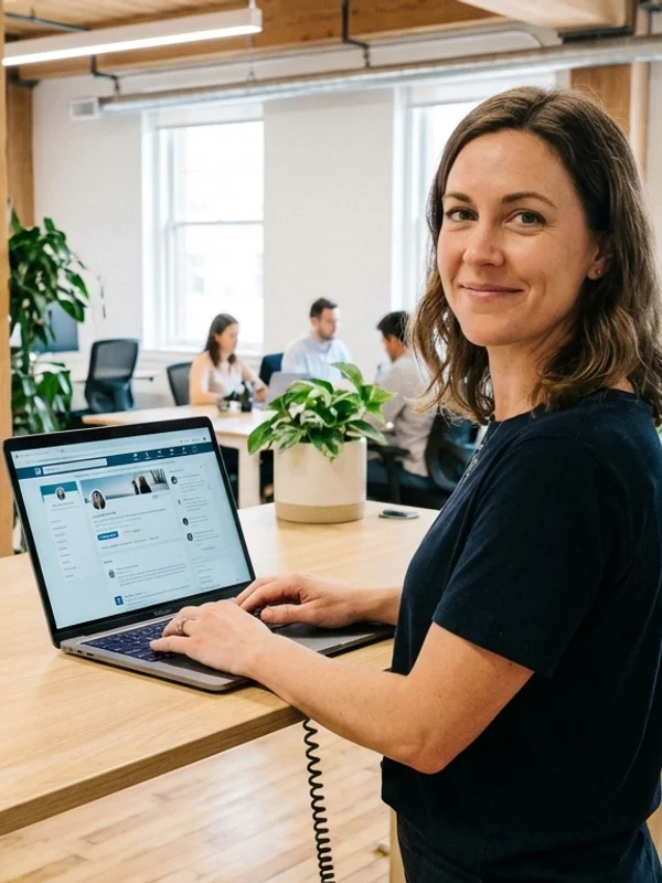
Best contextual option: softly blurred office
Riskiest choice: busy outdoor or lifestyle scenes with too much detail
The Fastest Way to Choose the Right Background
If you do not want the full theory, use this rule:
Go gray if you want the safest all-around LinkedIn background.
Go soft office if your role benefits from workplace context.
Go warm creative if you need a little more personality without losing credibility.
Go restrained outdoor only if the light is soft and the scene stays quiet.
The example gallery below shows these four directions side by side.
Why Background Choice Matters More on LinkedIn
On a portfolio site, people may view the image larger. On LinkedIn, they often see your face at thumbnail size in search, comments, messages, and connection requests. That changes the job of the background.
The best background does three things:
creates contrast around your face
signals the right professional context
disappears once the image gets small
That is why a clean gray or soft office blur usually beats a scenic backdrop. If the background becomes the most noticeable part of the picture, it is probably hurting the photo.
The Four Background Families That Win Most Often
1. Gray studio
This is still the safest answer.
Best for: finance, consulting, law, recruiting, and almost any general job-search use.
Why it works: gray is neutral, forgiving across skin tones, and easy to pair with common professional clothing. If you only test one direction, test gray first.
2. Soft blue or blue-gray
This is the clean corporate variation when you want a little more polish than flat gray.
Best for: corporate roles, executives, consultants, and anyone who wants a more LinkedIn-native look.
Why it works: cool blue backgrounds feel trustworthy and professional, and they usually pair well with navy, charcoal, black, and white clothing.
3. Light office blur
This is the best contextual option for people who want the photo to feel less studio-built.
Best for: founders, operators, recruiters, sales, customer-facing professionals, and advisors.
Why it works: it gives just enough context to feel current and credible without showing distracting desks, people, or clutter.
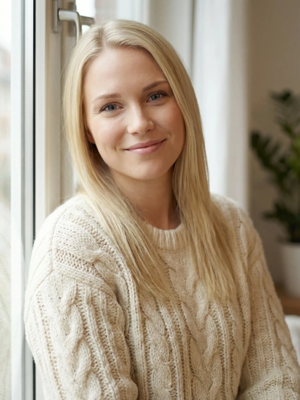
4. Controlled outdoor or warm creative
This is the higher-variance option.
Best for: creators, marketers, coaches, community-facing roles, and some modern startup profiles.
Why it works: it can feel warmer and more human than a studio setup, but only if the light is soft and the scene is simple.
Need better profile-photo options, not just more theory?
Compare several LinkedIn-safe backgrounds from one reference set
Use LensCherry to create your model from reference photos, then test gray studio, soft office, and warmer professional directions before you change the photo on your LinkedIn profile.
Tech, startup, product: gray, soft office, or a very controlled modern backdrop
Recruiting, sales, customer success: gray or office blur with a warmer expression
Creative, marketing, coaching: warm creative, white, or clean outdoor options with soft light
If the role is broad or you are mid-search, the safe move is still gray first. You can always test a second, slightly warmer option after that.
Background + Outfit + Crop Need to Work Together
Background choice is not separate from the rest of the image.
Create contrast. Dark blazer on medium gray works. White shirt on bright white usually does not unless there is enough separation.
Protect the circle crop. Fine background detail near your jawline or hairline makes the thumbnail feel noisy. This matters even more than people expect.
Keep the framing clean. If the photo is too wide, the background takes over. If the crop is too tight, LinkedIn may clip the hair or shoulders. Use our LinkedIn photo size and crop guide if the framing still needs work.
The Best DIY Background Setups
Simplest home setup
Stand a few feet away from a plain light wall and face a window. That is enough for a usable reference set if the light is soft and the wall is uncluttered.
Better office setup
Stand away from the background, use portrait mode or light blur, and keep monitors, people, and cables out of frame.
Best low-effort workflow
If the current camera roll is close but not good enough, create a few stronger options in AI Photos for LinkedIn. You can test gray, office, and softer creative directions from one reference set instead of reshooting everything.
When to Use AI Instead of Reshooting
AI is the cleaner fix when:
your expression is good but the setting is weak
Background examples
Four background directions that still read cleanly on LinkedIn
These examples compare the safest LinkedIn-ready background families so readers can see which direction matches their role before they swap the profile photo.
Ready to replace the weak profile photo, not just debate the backdrop?
Generate cleaner LinkedIn headshots and keep the background that wins
Create LinkedIn-ready options from your reference photos, compare a few safer background directions, and keep the one that looks strongest in the LinkedIn crop.
Light to medium gray is still the safest all-around choice because it keeps the face readable and works across most industries.
Are office backgrounds good for LinkedIn headshots?
Yes, if they are clean and lightly blurred. They work best when the scene gives context without becoming a second subject.
Do outdoor backgrounds work for LinkedIn?
Sometimes. They work best for warmer, people-facing, or creative roles when the light is soft and the scene is simple. They fail fast when the background gets busy.
Should my LinkedIn background be plain?
Usually yes. LinkedIn profile photos are small and circular, so simpler backgrounds almost always hold up better.
Can I test different LinkedIn backgrounds without another shoot?
Yes. That is one of the strongest uses of AI Photos for LinkedIn: create several credible background directions from the same reference set and compare them before updating the profile.
Your background should support the face, not compete with it. Once you have a stronger headshot, pair it with a cleaner LinkedIn banner, confirm the crop in our size guide, and keep the whole profile visually coherent.
Why it works
The blur suggests a real professional setting while keeping edges and contrast quiet enough for the circle crop.
Best for
Founders, operators, recruiters, and client-facing professionals
The Way to My Heart Is: 45 Hinge Prompt Examples That Sound Like a Real Person